
TheMighty.IO
tl;dr
Founded, lead, and brought to market a mobile game pop-up shop that connected in-app purchases to charitable impact. Turned $1.99 power ups into clean water, meals for hungry kids, and vaccinations.
role
As the lead product designer I transformed napkin sketches into wireframes & playable prototypes. When I wasn't shaping the legal model or forecasting growth projections, I was conducting game developer & player research, meticulously iterating user-centered flows & view, creating scalable design systems, interpreting behavior analytics, and writing some Sass.
Every aspect of product and feature decisions was a tightly collaborated effort between engineering and product design that constantly balanced the needs of our humans, technical feasibility, and speed to market.
featured by


UXD
Product Concept
Bring a product to market that connects a portion of the $15B/yr. in-app purchase market to charities. Create a light-weight 3rd party plugin for game developers (ie a “pop-up shop”) that effortlessly links their IAPs to real world impact and helps them market their game.
Research Highlights
- Mobile game IAPs generate $15B / year for game companies.
- $15B / year is generated by only 2% of players, creating a 98% opportunity
- Cause related marketing (ie Tom’s Shoes, Warby, etc) increases purchase behavior by 200%-500%.
- Cause association for brands elevates their brand equity
Game Developers / Publishers
For Game Developers the pop-up shop was integrated into the game's code base as a 3rd party plugin. This required low friction adoption while working seamlessly with existing in-app purchases.
Design Goals (Game Developers)
- Lightweight & flexible integration
- Easy integration
- Ability to choose a cause category
- Ability to specify portions that go to charity
- Ability to turn on / off pop-up shop
- Ability to test before release
- Ability to track performance, revenue, and donation
- Create as much good as possible
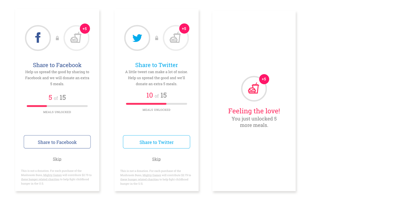
- Give players a way to “share the good” while marketing new players to the game
Players
The flows had to create as little cognitive overhead as possible, yet give the player options to dive deeper into each charity. There were a number of cause-related marketing compliance issues that had to be displayed to the player without creating complex legal noise.
Design Goals (Players)
- Low friction experience
- Understand their purchase impact in a simple and straightforward way
- Ability to share to social networks to project their altruism
- Find ways to introduce a “pop-up shop” that does not break the players mental model
- Ability to purchase quickly and return to game play
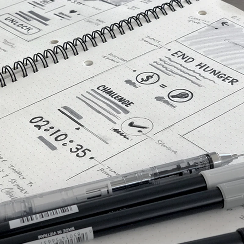

Flows & Views (Pop-up Shop)
The in-game experience of the pop-up shop was constantly iterated upon and went through 10+ releases & refactors inside of a 12 month period. As we constantly learned more about Game Developers & Players we improved upon several specific aspects:
- A ribbon integration that matched the visual texture of the game's design
- Flexibility in ribbon positioning
- Tested & removed a first-load modal that was too disruptive for Players
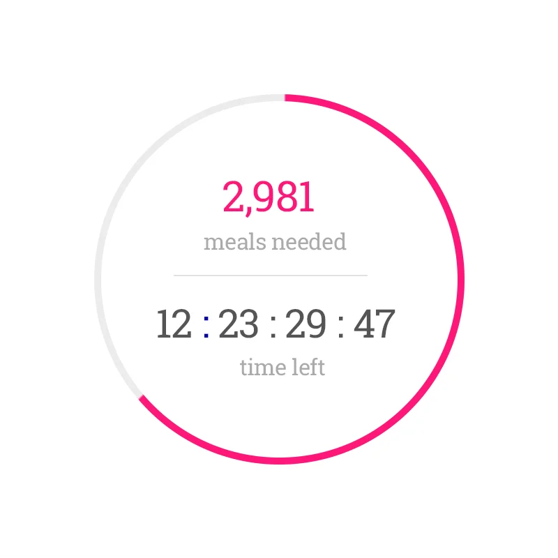
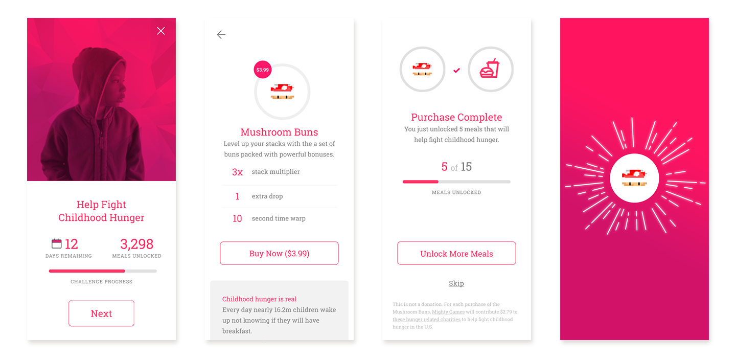
- Constantly improved the charity views and visualization. Specifically equated donation amount to whole units of impact (ie gallons of water, number of meals, number of vaccinations)
- Constantly refined charity content to be easily comprehended, but also provided paths for the Players to dive deeper.

DESIGN SYSTEMS
Created a visual system inspired by isometric game design, but was extended a flat system for in-app experience. Leveraged a reduced color palatte and typographic system to minimize load impact as well as cognative noise.


MVP & Prototyping
Created a playable iterations of the product complete with a simple game built in house. This allowed us to ship a playable MVP to our early adopters and collect behavior feedback through MixPanel tracking. It was critical to our traction to constantly test the product against our Game Developers & Players. Both has specific needs and challenges that had to be carefully calibrated in each release.
Challenges & Solutions
Ribbon Integration
Game Developers requested a flexible visual system to the "ribbon". The ribbon's texture needed to be malleable and harmonize with the games start screen artwork. Additionally, we had to develop controls for the placement of the ribbon since all start screen layouts are not the same.
Solution
We developed sets of ribbon artwork in a variety of styles (pixel art, isometric, flat, high gloss, and 3d). Additionally, we created a set of brand guidelines and provided Game Developers with art files to modify and submit for approval.
To solve the challenge of positioning we developed a drag tool for both vertical and horizontal layouts. The ribbon was able to be dragged and placed at any point along the 0 y-axis.
Validation
The Game Developer feedback to the new ribbon flexibility was overwhelmingly positive and as a result we saw an increase in the number of Game Developers completing our "integration goal" inside of our MixPanel metrics.

Cause Overhead
Our team was deeply invested in the early charities that were selected to be in our Alpha & Beta releases. It became clear during early iterations the amount & type of information we were presenting to the Player was causing friction and drop off.
Solution
We simplified the specific charities to cause categories (IE: Childhood Hunger, Clean Water, Vaccines). Above is an example of the Home Screen evolution from Early Prototype, to Alpha, to Beta. We evolved the UI from a darker (and dreary) system to one that was bright and optimistic. The content itself went through several iterations to strike a balance that helped the Player understand the cause association, impact, time constraints, and progress. We continually strived to reduce cognitive load without losing clarity.
Validation
During our testing we saw a substantial increase in the amount of Players purchasing items and a reduction in abondoning the pop-up shop.

Allocations to Charity
We believed it would be important to Game Developers to be able to set the % of money on each item that would go to charity. We failed to test this large feature early in the product lifecycle and decided it would be critical to the MVP. The belief was that as a Game Developer these in-app purchases provide critical revenue, and while they were willing to support charity there would be a limit.
Solution
Our team developed a slider for each in-app purchase. The purchase % would be recorded, timestamped, tied to a Player, and displayed in the Game Developers monthly invoice.
Validation
This was a failure. Every in-app purchase was slid to 100% of the proceeds going to charity (even though the default value was set to 40%). We learned a valuable lesson to talk and test earlier. We could have saved valuable engineering time by simply locking the slider to 100% and recording if it was moved as well as clear messaging to the Game Developer that the ability to allocate less would be coming.
Ways to Improve
- Reduce Assumptions: would have found more ways to play test features before they were fully engineered. Specifically with the Charity Slider,
- Charity Slider: would have tested sooner in a more lightweight way. The feature engineering added overhead that was used differently than our core assumption.
- Charity Load: would have tested charity views earlier to find ways of reducing cognitive load.

